


Mirror Apparel E-commerce
research | definition | ideation & strategy | prototyping | iteration
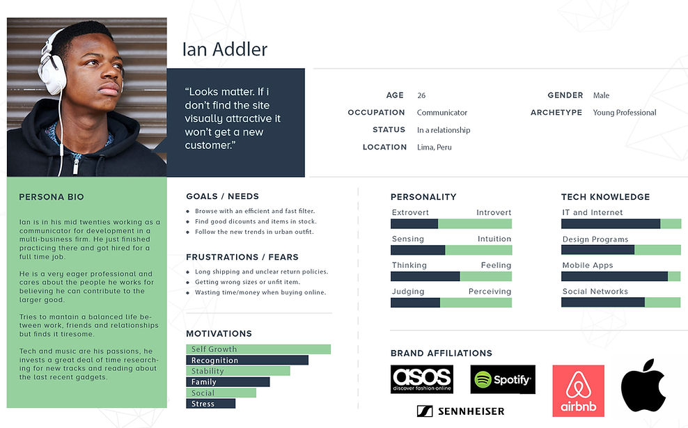
PRIMARY PERSONA:
Meet Ian. I developed his persona to synthesize and illustrate my findings in human terms. I compiled behavioral attributes most common to the interview participants. He is a young professional with high goals and a great sense of fashion.

FINDINGS:
-
Most users prefer to buy clothing that they can try.
-
Majority of users when buying online prefer a free delivery service with
free returns in case it doesn't fit. -
All participants buy out of need but tend to browse out other options.
-
Brand loyalty is important.
-
Discount prices are never overlooked and even searched.
-
All users highlighted the need for a strong filter.
-
All users interviewed only buy online when they have the time to wait.
-
Strong imagery is a must.
“If it takes me too long to pay for something I just move on…”
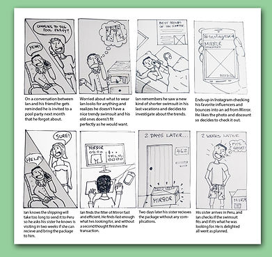
STORYBOARD:
What's the trigger that pushes my persona to buy something online? Is it a need, or a coincidence? I thought of the process while drawing this storyboard.
What's the flow of the events that lead Ian into Mirror. Thinking about what can trigger Ian into deciding to buy a trendy outfit and what could be the process of going through that for him.
Background
Mirror is a fictitious global retail clothing store with over 400 stores around the world in 32 countries. Their mission statement is to bring people good quality clothing with affordable pricing for every style.
Challenge
Mirror is massive and they are immensely successful offline but now they want to bring this success to an online digital platform. They want to build a responsive e-commerce website that is approachable and easy to use for everyone. They also want to rework their brand with a modern new logo that looks slick, minimal and clean.
Approach
Apply the design thinking process approach with an interactive process. With heavy research on motivations and pain points to pinpoint opportunities to enhance the current e-commerce experience.
Project Duration: 90 hours.
Role:
Creative Direction
UX/UI Design
Research
Interaction Design
Prototyping
Usability Testing
Tools:
Adobe PSD, Illustrator
Optimal Workshop
Invision
Zeplin
1
EMPATHIZE
Methodologies: Primary & Secondary Research, Competitive Analysis, Interviews, Empathy Map.
RESEARCH GOALS:
The goal of this project was to create a seamless e-commerce website shopping experience for Mirror's customers. I wanted to uncover their reasons to do what they do, their behaviors at the moment of buying and their preferences when retail shopping. I started by doing primary and secondary research and proceeded with methodologies like contextual inquiries, interviews, and competitive analysis.
-
Learn user needs and what is an optimum shopping experience in an online store for them.
-
Discover user pain points and where they struggle whenever they buy online.
-
Empathize with the users and find their motivations and needs.
-
Learn what drives competitors successful and research their accomplishments.
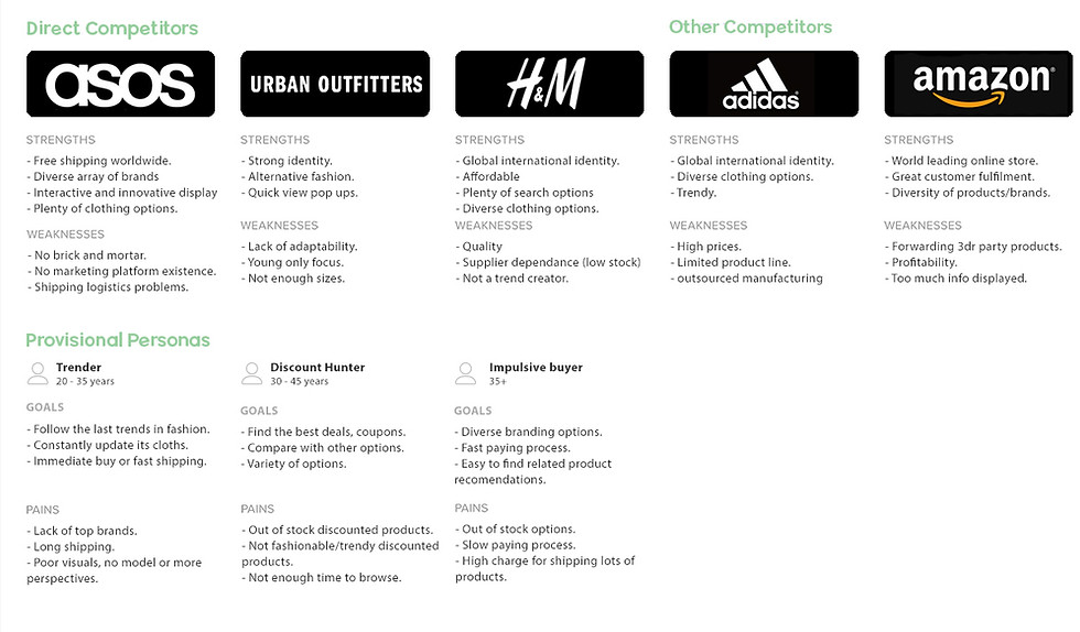
COMPETITIVE ANALYSIS:
The empathy phase started by analyzing the current landscape of clothing e-commerce services and. A competitive analysis was conducted to spot the most successful features and opportunities for improvement. This pre-research led me to create a strong roadmap.
INTERVIEWS:
Three interviews were conducted to assess the main barriers, motivations and great user experiences current customers find when they buy clothing online. These interviews were done to users that had bought online in the lasts months, and questions were open-ended to be able to focus at listening to their experiences.
ASSUMPTIONS:
-
No interactions with products before
before arrival is a problem. -
Since there is no physical interaction
clothing sizes are a concern. -
Delivery times can be a hassle in worldwide shipping.
-
Long complicated paying processes
are a strong pain point. -
Free delivery services are a strong motivator.
-
Good visual design and pics with models sell clothes.

EMPATHY MAP:
I imagined Ian's daily life and how he interacts with fashion and his online buying experience. Putting myself in his shoes to understand why and how he makes the choices he does. My focus was on the buying experience since that's where my research is focused.

2
IDEATE
Methodologies: Roadmap, Card Sorting, Sitemap, Task flow & User flow.
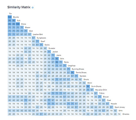
CARD SORTING:
After clearing out the project goals and building the right roadmap. I started the Ideate phase creating a card sorting exercise in Optimal Workshop with apparel items to be grouped into open titled groups. This task was done to analyze how different people group up certain objects to be able to approach and build a great sitemap.
Interestingly this method didn't provide me with a genre group, or body part. This resulted in a problem later on with the flow. This could, of course, be a cause of having few people do the test. Or adding more items of 1 genre over the other.
SITEMAP:
At first, I mapped the site with the card sorting information provided, that led me to do it genderless. This was interesting since it was something new. The competitive analysis showed me that all clothing e-commerce have gender grouping, and most of them have body parts grouping. This would lead me to a problem later on at the prototyping and testing phase. So I ended up doing two versions to test it out.
The flow of the clothing tab of the genderless sitemap was not seamless, I reiterate on it until it was done right. Ended up changing the mapping and included gender in it. The product page ended up being three clicks away.

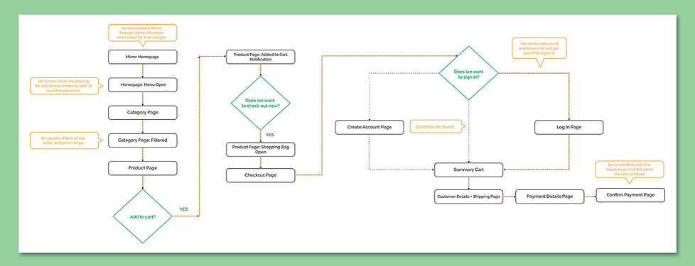
USER FLOW:
After reviewing my persona, his storyboard and tasks, I created the user flow for the prototype test.
3
DESIGN
Methodologies: Sketches, Wireframes, Low & High Prototype, Responsive Design, UI KIT.
SKETCHES:
So with all the research and ideating phases done I went ahead and drew some sketches to solve our problems. Taking into account our roadmap and project goals.

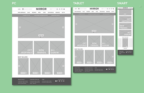
RESPONSIVE WIREFRAMES:
With the architecture set and the features and ideas sketched, mid-fidelity wireframes were created for both desktop and mobile versions to quickly test the structure and layout among potential customers and iterate if needed to, later on, build the high fidelity ones.

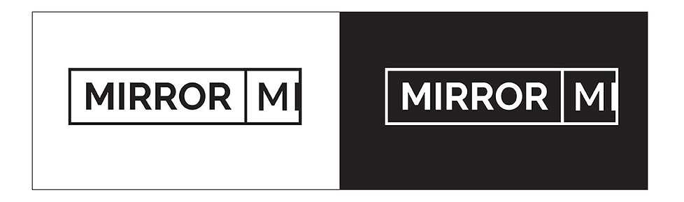
Branding & UI KIT:
The new brand visuals and feel had to convey a clean, minimal and modern look. I played with different typography that would fit those descriptions then added detail to it and some color. But in my research, some of the most known brands of clothing in the web have simple logos so I decided to follow that trend and chose this one, simplifying my previous drafts to clean it to its root state. Once finished the colors for the page were chosen and UI KIT formed.

4
PROTOTYPING & TESTING
Methodologies: High Fidelity Prototype, Usability Testing, Affinity Map, Priority Revisions, Next Steps.
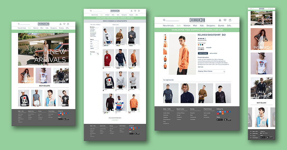
HIGH FIDELITY PROTOTYPE:
USABILITY TESTING:
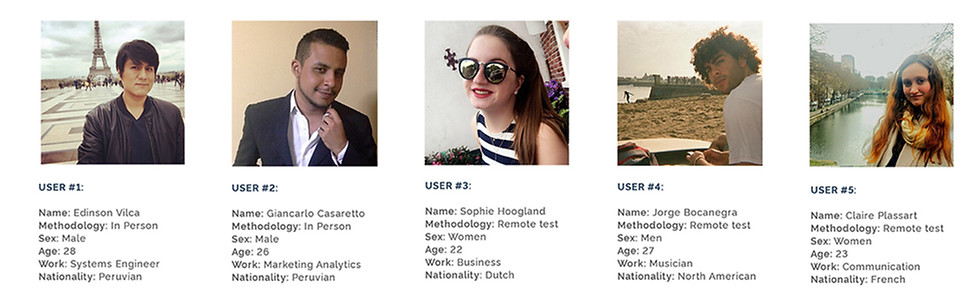
Using the hi-fi wireframes I put up a prototype in Invision. This test was done to test the usability of the site I built and the effectiveness of users going through the process of buying apparel online and if there are any pain points. Five participants were asked to buy a specific item a Relaxed Sweatshirt of orange color and large size. The tests were done in person and on Skype.
FINDINGS:
-
100% of participants finished the task. (40% error free).
-
60% of participants headed to the color filter before the style. (different order than test).
-
80% of participants found the size icons too small.
-
80% of participants had trouble filtering the items. (browse by section not visually effective enough).
-
The formulation of the task gave some complications. (relaxed as a style and not a type).
-
The second test for the recipe creator had some errors.
-
60% tried to filter items through filters not implemented.
AFFINITY MAP:
Using the information gathered from the usability test findings, I grouped the results under similar categories. Made it easier to analyze the information needed to iterate on a better version of the site. By finding simple solutions for the pain points found in the tests.

PRIORITY REVISION:
After gathering and analyzing the feedback data of the usability testing with the affinity map I reiterated on my high fidelity prototype. Took out a search filter shortcut that wasn't adding anything since all users were skipping it. Reworked the filter order and size to fit users expectations. And resized most of the icons and text so it's more visible and easily clickable. The process was much more smooth and seamless after this last iteration.

REFLECTIONS & NEXT STEPS:
With more time at hand, I would go back and reiterate on some of the UI elements, make them cleaner and rework the visual design with a fitting texture to lessen the big white areas. The only working sections where the ones are chosen exactly for the task at hand, I want to go back and add more features that are missing like the paying process and the log in sections.


