


Telefonica
Core App Redesign
My Role and Team
Role: UX Responsible
1 PO
1 Proxy PO
1 Solutions Architect
8 Developers
Platform & Impact
IOS / Android (Native)
Goal: 2+ Million users at launch
Outcome: Launch targets exceeded in first month
Methodologies
User Research & Focus Groups
Journey Mapping
Information Architecture Guerilla & Usability Testing
Design Systems
Interaction Design
Tools
Figma
Optimal Workshop
Marvel
Maze
Invision
Zeplin
The Challenge
Building a localized app on top of an existing product
Telefónica Peru was transitioning away from it's Spanish core app and needed its own experience adapted to the local market. While the underlying product structure, layout and brand foundations were shared, the Peruvian app required a new home experience, system, redesigned account and login flows, and a broad set of new services and features.

Research & Validation
1.Understanding our users
Before sketching a single layout, I needed to understand our target audience's core behaviors, pain points, and motivations.
To achieve this, I personally managed the user research pipeline, designed the initial participant screening criteria tailored to our project goals, coordinated with our CRM and data operations teams to extract targeted user lists, and handled the outreach and incentive management, personally scheduling and offering compensation to participants for their time. I then conducted the comprehensive, one-on-one interviews and focus groups myself. The data from these interviews was synthesized into behavioral personas and journey maps serving as reference models for our teams

2.Design and testing
Once the initial research established my design direction, I translated the user insights into rapid, interactive prototypes using Figma and InVision to simulate user flows. To validate these concepts without slowing down momentum, I leveraged a unique structural advantage: an active agency located directly below our offices.
Instead of waiting weeks for formal testing cycles, I ran down the stairs with early interactive prototypes created on Invision. Using simple, coupon-based recruitment, I pulled real customers into impromptu, 10-minute guerrilla testing sessions to see where our design assumptions failed.


3.Validation and outcome
By separating our foundational research from our rapid validation loops, we eliminated guesswork at both ends of the project. The initial deep-dives ensured we were solving the right problems, while the downstairs guerrilla testing ensured we were solving them correctly, saving dozens of engineering hours before a single line of production code was written.

Product Experience
Using Telefónica Spain's design system as a starting point, we evolved and expanded it alongside three other designers working across B2B and web. The new Peruvian app needed to feel familiar enough for existing users to migrate from the legacy app, while staying true to Peru's brand and product needs. I redesigned key journeys such as account, login, and payment while designing entirely new service experiences for the Peruvian market, like subscriptions, suspensions of service, etc.
Registration & Login
The existing authentication experience needed to be adapted to the Peruvian product and provide a clearer entry point into the new app. The challenge lay in the fact that registration could be done with different types of documents, and not all users had the same type of product, so security measures were different.

Home & User data
The Home had to be redesigned, the challenge was it had to be a central hub for managing user's different Telefónica services. Users could switch between mobile lines, TV, cable and internet plans, with the information and available actions adapting to the selected service. The experience brought together key data such as data usage, remaining allowance, payments, subscriptions etc, in a single, flexible dashboard.


User control & service support
To empower users and alleviate pressure on our support infrastructure, I designed a comprehensive account management and self-service ecosystem from the ground up. The objective was to replace traditional call-center dependency with an intuitive digital tool where customers could independently cancel, suspend, or modify their plans. If an anomaly occurred, the system guided users through contextual self-assistance workflows before seamlessly routing them to a live assistant or a dedicated WhatsApp channel as a final resort.
The primary UX challenge lay in mapping a massive matrix of user problems and categorizing them into cohesive, multi-service flows. Technical troubleshooting for television connectivity is fundamentally distinct from troubleshooting mobile data drops or home internet outages. Each required dedicated logic branches.
Beyond the front-end layout, the design had to align perfectly with complex backend engineering constraints—determining exactly when a user's action would trigger automated system API calls (such as instantly provisioning a line suspension) versus when it needed to pass the user's validated intent and context directly to a human agent. By systematically breaking down these service silos and designing tailored diagnostic trees, the platform successfully modernized the support experience and reduced contact center call volume by 17%.

Streamlined payment
Designing the application's native billing and transaction ecosystem from scratch was one of the most complex, long-term challenges my team and I faced. Because we operated entirely through our own payment processing architecture rather than relying on external providers, every layer of security, error handling, and state management had to be explicitly designed and accounted for. Our core objective was to take an incredibly convoluted matrix of account types and distill it into a swift, secure, and friction-free payment experience.
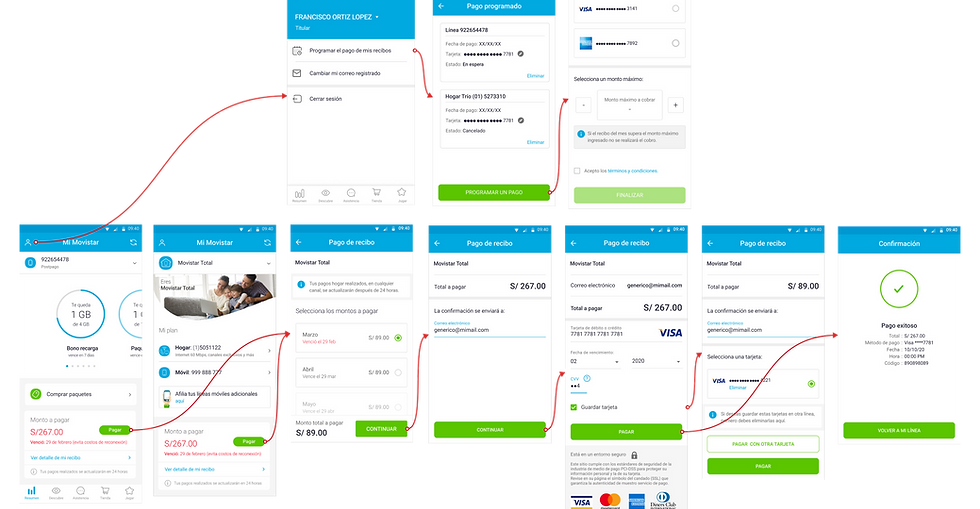
The true UX complexity emerged when mapping the intersection of user access levels, service types, and financial states. The system had to gracefully handle a wide variety of volatile customer scenarios:
-
Access Tier Restrictions: Security protocols dictated strict information siloes. If a user logged in quickly using just their mobile number, they could only view and pay the bill for that specific cell phone line. To pay for home internet, television, or landline bundles, the interface had to prompt and guide them through a secure re-authentication flow using their national identification number (DNI/ID).
-
Recurrent vs. Fragmented Billing: Users frequently managed multiple services simultaneously, blending standard recurring monthly subscriptions with one-off top-ups or hardware installments.
-
Delinquency & Service Interruption: The design had to carefully manage the high-stress "in the red" state. If an account fell into delinquency, the UI had to immediately pivot to a high-urgency recovery flow, balancing empathetic messaging with clear warnings about imminent service cut-offs, while providing an instant, one-tap clearance pathway.
-
Tokenized Card Management: We had to design an intuitive card-vaulting workflow. The system required clear toggles allowing users to decide whether or not to securely save a card for future transactions, establish a primary payment method, and manage a strict maximum cap on the total number of saved cards permitted per account profile.
Key Takeaways
This project was my first UX role and gave me the opportunity to take ownership of the experience across a complex, multi-service product. Working as the sole UX/UI designer within a cross-functional team taught me how to turn broad product requirements into structured user journeys, while working closely with product and engineering to navigate technical constraints.
The scale of the project also taught me the value of getting close to users. Through interviews, focus groups, guerrilla testing, and usability testing, I was able to validate ideas directly with customers and iterate quickly.
The result was a product launched to 3M+ users, exceeding its launch targets in the first month and contributing to a 17% reduction in contact center call volume. More importantly, the project established the foundation of how I approach product design today: understand the complexity, simplify it for the user, and validate decisions through real-world feedback.


